Saturday, April 23, 2011

VBFS , designed with that "safe angle" in mind

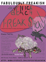
The latest in the "Fabulously Freakish" Venice Beach Freak Show is still using a compound grid (but reconfiguired)  and is targeting "local adults that would not ordinarly go to the freakshow". 
 This current design is using the illustrations as the attraction with text inclosed in boxes giving structure and order for our target adults  that do not like to "go outside the box".  The pastell colors used, offer a "safe, non-threatening feeling for our target audience.

The illustration of the "turtle" actually creates the illusion of breaking through it's sphere and enters those "safe" structured text boxes.  With the text in the right hand box, it describs the turtle "sunning itself on California beaches (doesen't everyone want that) and an inviting "Welcome" in yellow text.
Sunday, April 17, 2011

The Venice Beach FreakShow Progress

After the first critique I went to work on creating the multi-head/legged animals as illustrations.  I have created both a turtle and a frog that I like.  Of course a big part of the project is placement of the pieces and text to create movement and flow.
Currently I have a one nearly completed version that I am working on the color(s) set with.


First draft with illustrations

In the Second version I am trying to create a "banner" to be included as part of the presentation.

Second Draft

The banner is laid flat and of a canvas texture with stitching around the outside edges.  The slogan runs vertically to catch the viewer's attention.  From there to catch more interesting information, one must turn the page to read.  For all those that won't put the effort in to turn the page, there is a Venice Beach and freakshow at the bottom of the vertical page layout.


The Freaky Progress of the Freakshow Project

Mesmorizing Draft (black and white version)
For the Venice Beach Freak Show, the first presentation included pictures  of animals and skeletons from the freak show.  A collage of three photos were used on top of a "mesmorizing circular movement background".  It was first created in color and later converted to black and white (as per project instructions).
In all honesty, I think the color version  captures more excitment than the black and white version.
While I am still having problems uploading any files (have tried AI, Photoshop, JPeg, FNG)  to the blog, I just managed to get this photo up now (4/22/11).

I tried to give it a 70's feel using the two fonts (including Comic Sans)

 The critique suggested that I illustrate the attractions (animals) to create something more in tune with my creative abilities.  Looks like that is what I will be doing.